
TradeWindow Assure is a comprehensive solution that ensures the integrity and traceability of supply chains. The product consists of an admin portal, a field app (iOS and Android), and a public-facing page that displays provenance information. My role as the lead UX designer was to develop a cohesive design system that would work seamlessly across all platforms while maintaining a consistent user experience.
I collaborated closely with a team of developers and a product manager to ensure the design system was flexible enough to accommodate each platform’s unique needs, while still delivering a unified experience across the board.
Challenges
- Multiple Platforms: Designing for three distinct interfaces—an admin portal, a mobile field app, and a public webpage—each with its own set of user needs and functionalities, required a system that could adapt while maintaining consistency.
- User Diversity: The users ranged from supply chain administrators and field workers to the general public, all of whom had different goals and technical abilities.
- Scalability: The design system needed to be scalable and flexible enough to evolve with future updates to the product without losing its coherence.
Design Process
Research & Collaboration
The project began with an in-depth research phase, where I collaborated with stakeholders, including supply chain managers, field workers, and consumers. We identified key pain points in current supply chain transparency tools and gathered requirements for each platform.
I also worked closely with the product manager and developers to understand the technical constraints and opportunities for each platform, ensuring that the design system would be feasible and easily implemented.
Building the Design System
Once we had a clear understanding of the requirements, I set about creating the design system, focusing on several key areas:
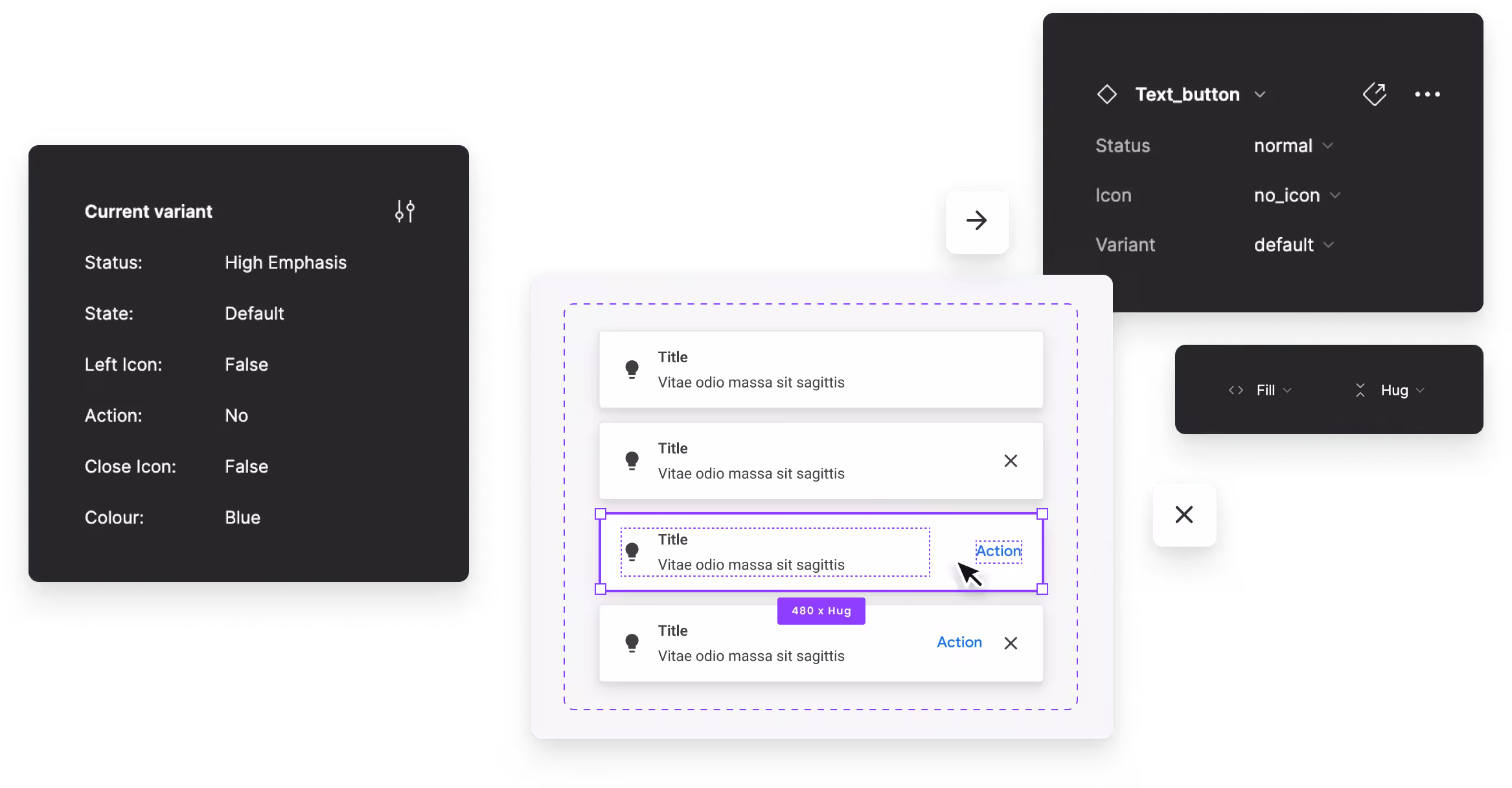
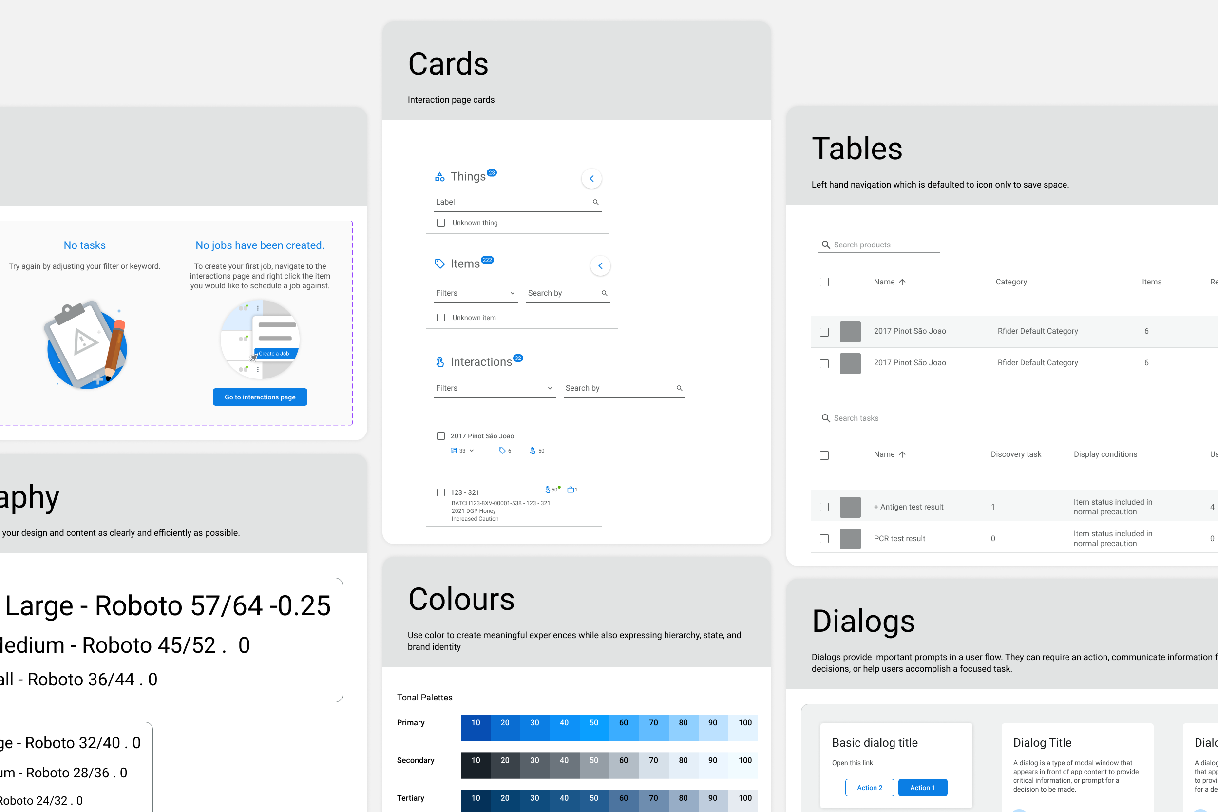
- Consistency Across Platforms: I developed a shared visual language and components that could be applied to the admin portal, mobile apps, and public page. This included consistent colour schemes, typography, buttons, and form elements.
Modular Components: The design system was built with scalability in mind, allowing developers to easily reuse components and adapt them to new features or platforms. - Field App Optimisation: The field app was designed to provide a seamless user experience on both iOS and Android. The design system included specific guidelines for mobile interactions, ensuring that the app was responsive and intuitive for users in the field.
- Provenance Page Simplicity: The public-facing page had to be simple yet effective in communicating provenance information to users. The design system helped streamline the layout and interactions, allowing users to easily understand the traceability of the products they were viewing.
Wireframes & Prototypes
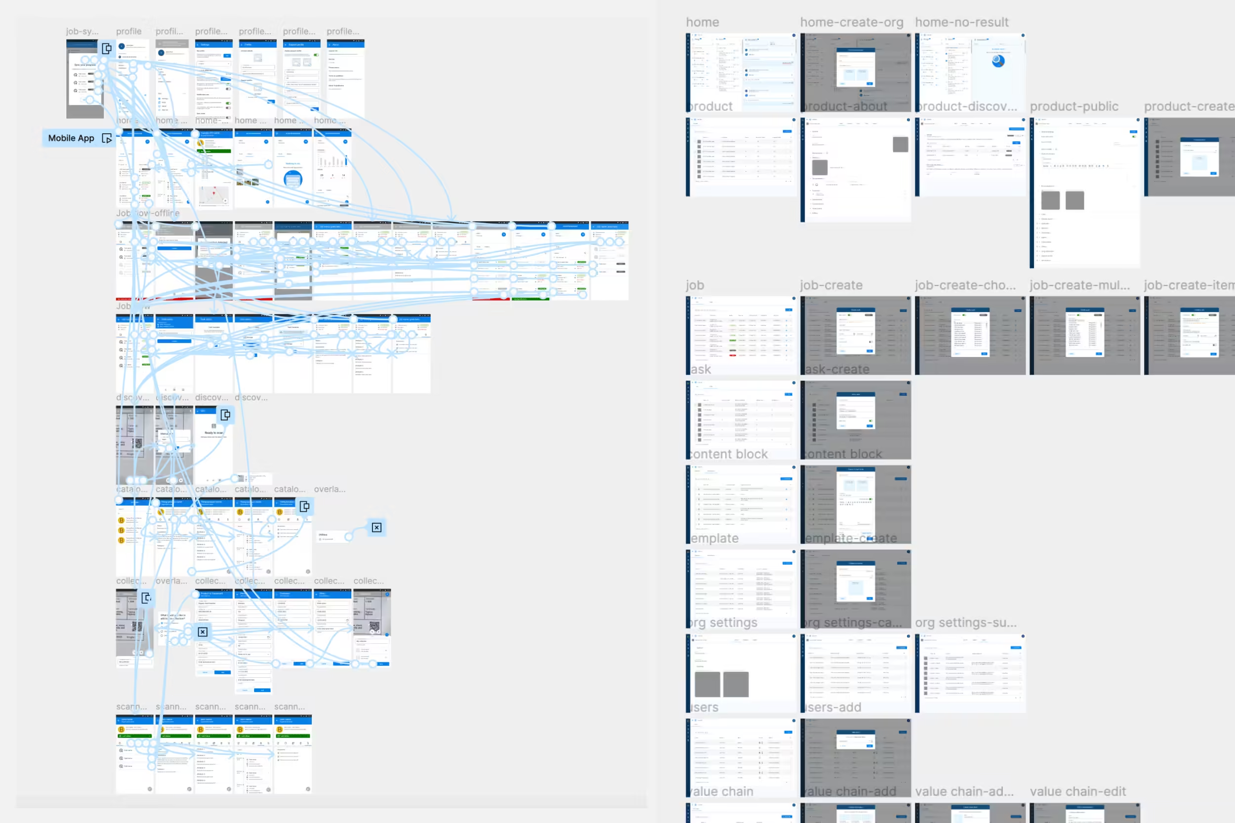
Using Figma, I created wireframes and interactive prototypes for each platform. These prototypes allowed us to conduct early testing and validate the user flows with both internal teams and select external users.

User Testing & Iteration
After developing the initial prototypes, we conducted usability testing with real users from the supply chain industry and internal stakeholders. Feedback from these sessions informed several key iterations, particularly around the mobile app’s usability in low-connectivity environments and the admin portal’s data management features.
Final Design & Handoff
Once we finalised the designs, I worked closely with developers to ensure a smooth handoff. I provided detailed documentation for the design system, including style guides, component libraries, and interaction patterns for each platform. This ensured that the developers could implement the design consistently across the admin portal, field app, and public page.
Solution
The result was a unified design system that maintained consistency across all platforms while addressing the unique needs of each user type. The admin portal provided administrators with a powerful and intuitive interface for managing supply chain data, while the field app offered a streamlined experience for workers on the go. The public-facing provenance page presented complex information in a simple, easy-to-understand format for consumers.
Key Design Features
- Consistency Across Platforms: Shared visual language and components ensured a seamless experience for users, whether they were using the admin portal, field app, or public page.
- User-Centric Design: Each platform was tailored to its specific user base, offering intuitive navigation, clear calls to action, and an overall smooth experience.
- Scalability: The modular design system allows for easy updates and the addition of new features without disrupting the user experience.
Results
- Improved Usability: The unified design system resulted in a 30% increase in user satisfaction, with users praising the consistency and ease of use across platforms.
- Increased Efficiency: The admin portal and field app allowed users to manage supply chain tasks more efficiently, reducing time spent on data entry and field reporting by 20%.
- Public Trust: The simple, transparent provenance page helped increase consumer trust in the product’s traceability, contributing to higher engagement rates.