Themes
The system structure leaves room for theming as its own concern, which helps visual consistency scale without collapsing everything into one monolithic layout pattern.
This page documents the Seequent design system as a working product asset rather than a visual style guide in isolation. The value of the system is not only in its color, typography, or components, but in how it creates consistency across multiple data-heavy products while still supporting the needs of different layouts, technical contexts, and implementation targets.
The UI kit already shows the system operating at multiple levels:
The current Seequent UI kit is structured into a set of major areas that make the system navigable and scalable:
This matters because it shows the system is not only a library of buttons and inputs. It is organized to support everything from low-level foundations through to higher-order product structures and implementation contexts.
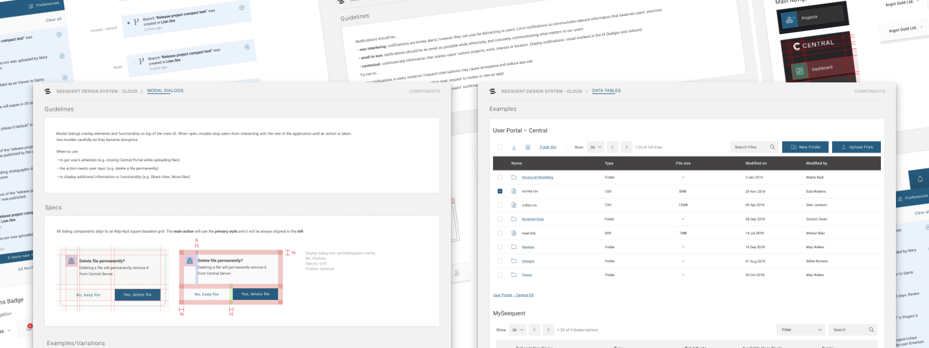
Component inventory
This curated component showcase is much closer to how the system is experienced in practice, highlighting representative patterns like notifications, data tables, and modal dialogs instead of only listing categories.
At the foundations level, the kit already establishes the visual and structural rules that keep the system coherent across products. The main page calls out color, dark mode, typography, icons, layout, imagery, and supporting design assets as first-class parts of the system.
What makes this important is that the system is not framed as a thin skin on top of product work. Foundations are treated as the rules that make later component and layout decisions easier to scale and easier to maintain.
The component inventory shows the operational depth of the system. It covers the kinds of patterns that technical users rely on repeatedly: accordions, buttons, chips, data tables, date pickers, dividers, lists, menus, messaging and alerts, modal dialogs, notifications, navigation, pagination, process indicators, scrollbars, selection controls, sliders, text inputs, tabs, and tooltips.
This is a strong signal of system maturity. The breadth of the inventory suggests the system is intended to support real application work, not just marketing pages or a narrow UI surface.
The kit also separates themes, layouts, and implementations, which is one of the clearest signs that it is designed to scale across a product family rather than a single application. In the implementation mapping, the system already points toward product contexts like User Portal - Central, Web Viz, and MySeequent.
Themes
The system structure leaves room for theming as its own concern, which helps visual consistency scale without collapsing everything into one monolithic layout pattern.
Implementations
The kit explicitly connects the system to real product surfaces, which makes the design system legible as infrastructure for products, not only as a design artifact.
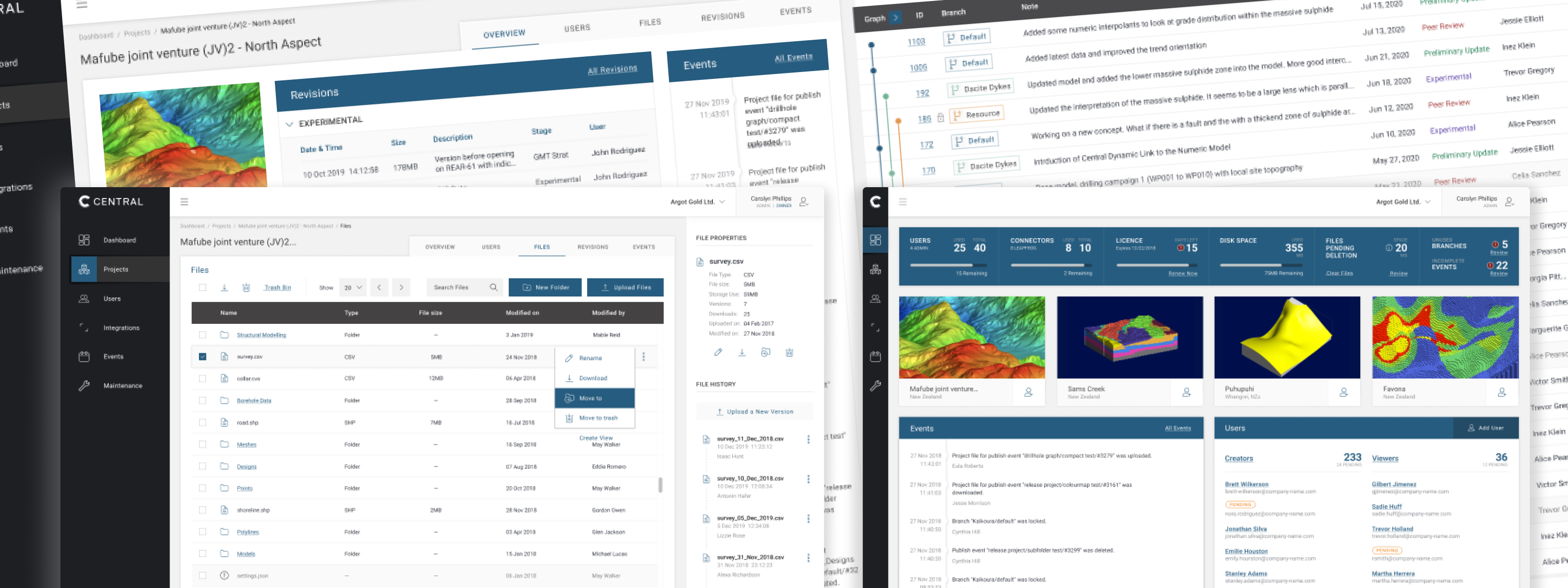
Implementation mapping
The implementation showcase ties the system back to real Seequent product surfaces, making it clear that the kit supports operational interfaces rather than existing only as an internal library.
Having a shared design system created the conditions for better product consistency, faster design-to-development handoffs, and a common vocabulary between design and engineering teams. It also made it possible to onboard new team members more quickly and reduce the decision fatigue that comes from rebuilding the same patterns across multiple products.