Time study result
Using Cube saved 1m 53s per booking
(Traditional method took an average of 3m 19s)

Designing a single source of truth for fragmented trade workflows
Global trade does not usually fail in one obvious place. More often, it breaks across inboxes, disconnected systems, missing documents, unclear status updates, and too many people trying to reconstruct what is happening from partial information.
Cube was designed to bring that work together. It gave exporters, importers, and supply chain partners one place to securely collaborate around trade data, documents, bookings, shipment visibility, chats, workflows, and status updates. The goal was not to create another trade tool. It was to create a shared operational view of the shipment lifecycle.
My role was to help make that complexity usable. The challenge was not just supporting multiple users. It was structuring a product that could feel like a single source of truth across logistics, compliance, communication, and operational tracking without collapsing under the weight of all that complexity.
Cube was intended to give users a more unified way to manage trade operations: shipments, documents, compliance, approvals, onboarding, and organisational setup. The ambition was strong, but the domain made the product difficult in very particular ways.
Trade is not one workflow owned by one role. It is a chain of intersecting responsibilities, each with its own language, dependencies, and risks. That meant Cube could not be designed around a single primary user with everyone else treated as an edge case. It had to work at the intersections between multiple specialist roles.
That insight shaped the whole programme.
The early work focused on understanding how trade processes actually operated across the people responsible for them. This was not a product that could be designed around one ideal user or one tidy workflow. It had to support a chain of intersecting responsibilities across logistics, compliance, documentation, approvals, and operational coordination.
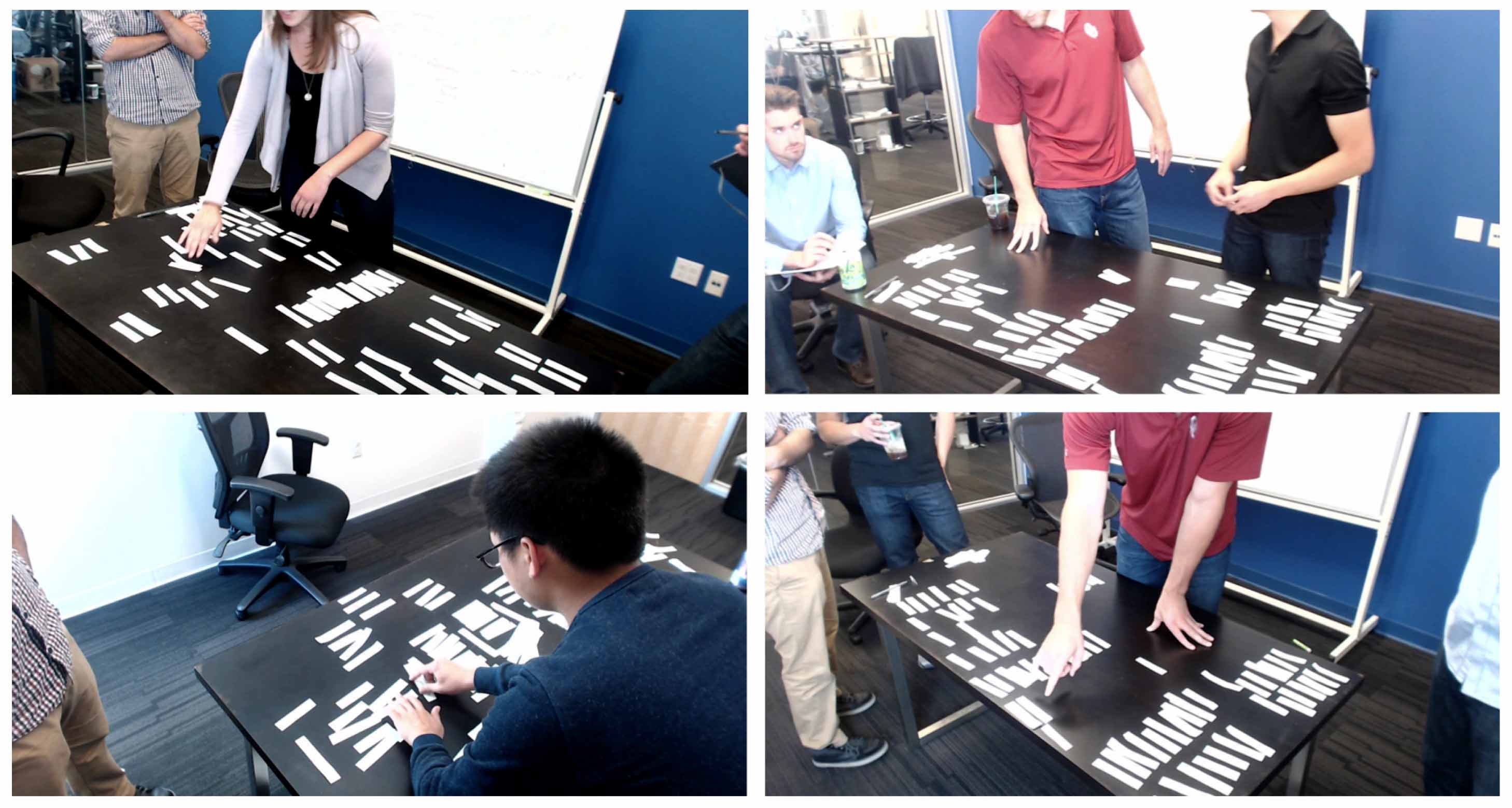
One of the most useful parts of the discovery phase was working through the process collaboratively with stakeholders. The workshops helped expose where responsibilities overlapped, where information broke down, and where users were being forced to carry too much of the process in their heads.
That mattered because the challenge was not simply to digitise an existing process. It was to make a fragmented, multi-party system more coherent without pretending the complexity was not there.
The research quickly made one thing clear: in international logistics, no one knows it all.
Each participant in the process had deep expertise in their own slice of the work — customs, shipping, documentation, finance, approvals, compliance — and just enough knowledge of adjacent steps to keep things moving. That meant the design problem was not just about simplifying a task. It was about helping people move through a shared system without losing sight of where they were, what they were responsible for, and what needed to happen next.
This led to one of the most important product principles in the project:
To make the complexity more actionable, I translated the research into role-based scenarios and user stories. This gave the team a more practical way to reason about how responsibilities overlapped, where workflows diverged, and what different users actually needed from the platform.
That work helped turn a broad, messy domain into something the product team could make decisions against.

Once the user roles and handoffs were clearer, the next challenge was to understand how the workflow itself needed to behave.
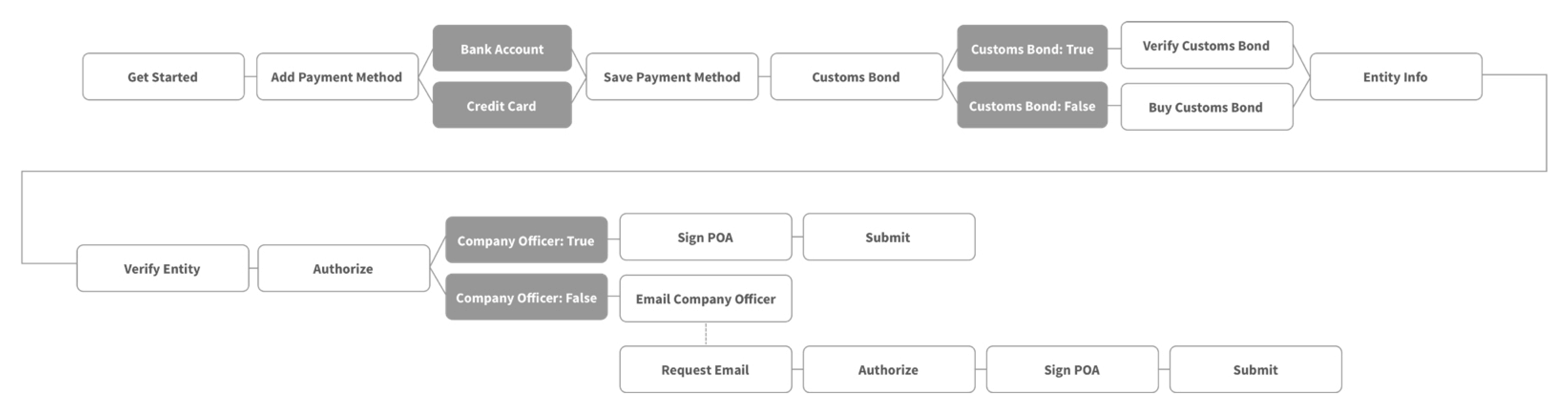
The difficulty was not the existence of forms or fields. It was the number of dependencies, branches, permission questions, missing documents, and edge cases that appeared once a real business tried to move through onboarding and operational setup properly.
We reviewed requirements with the product team, aligned on business and user goals, and then mapped the flow in more detail. The aim was not simply to move users from start to finish, but to make the process understandable when things did not proceed cleanly.
For example:
These were not small details. They were central to whether the product felt usable or bureaucratic.
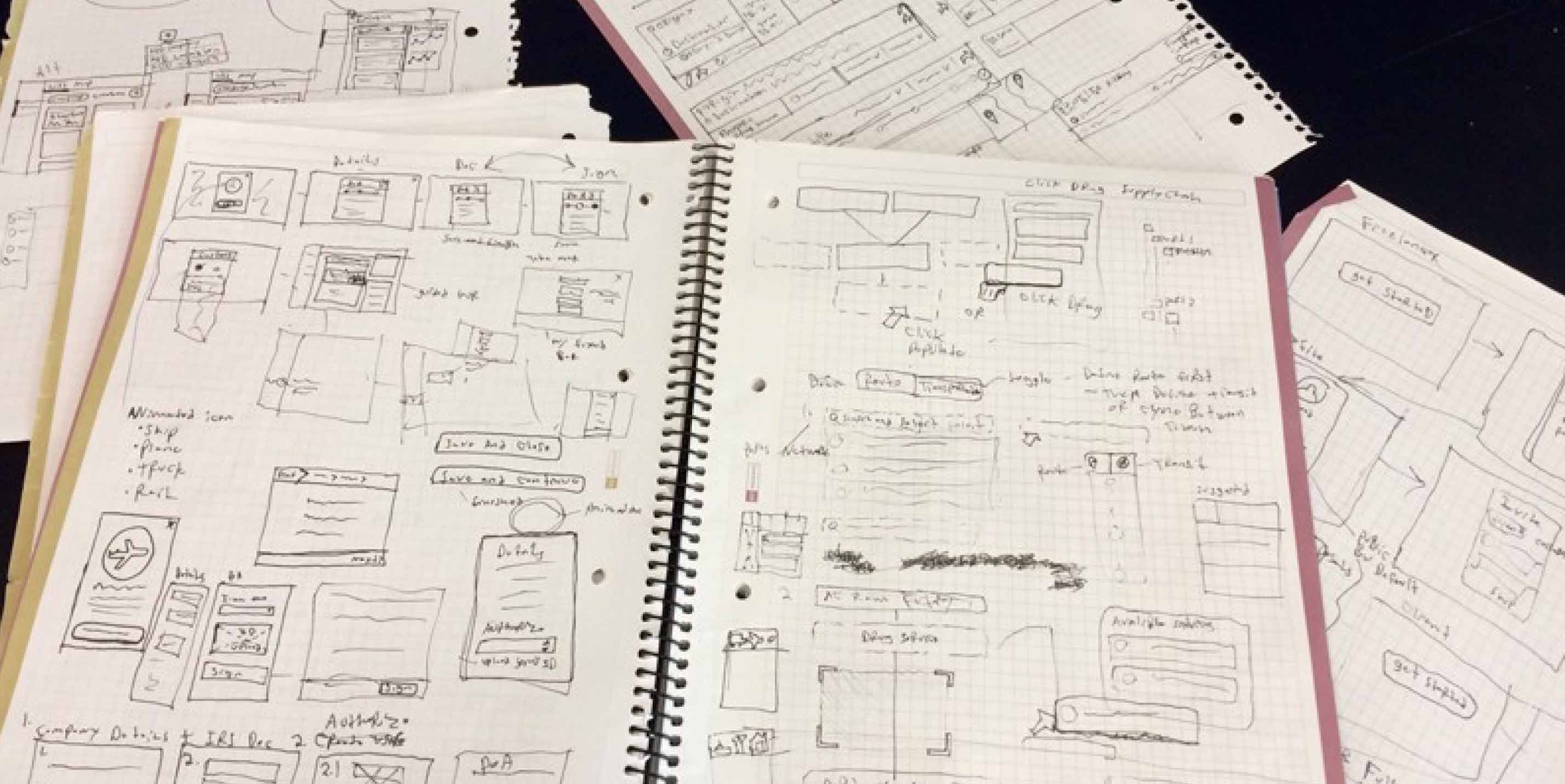
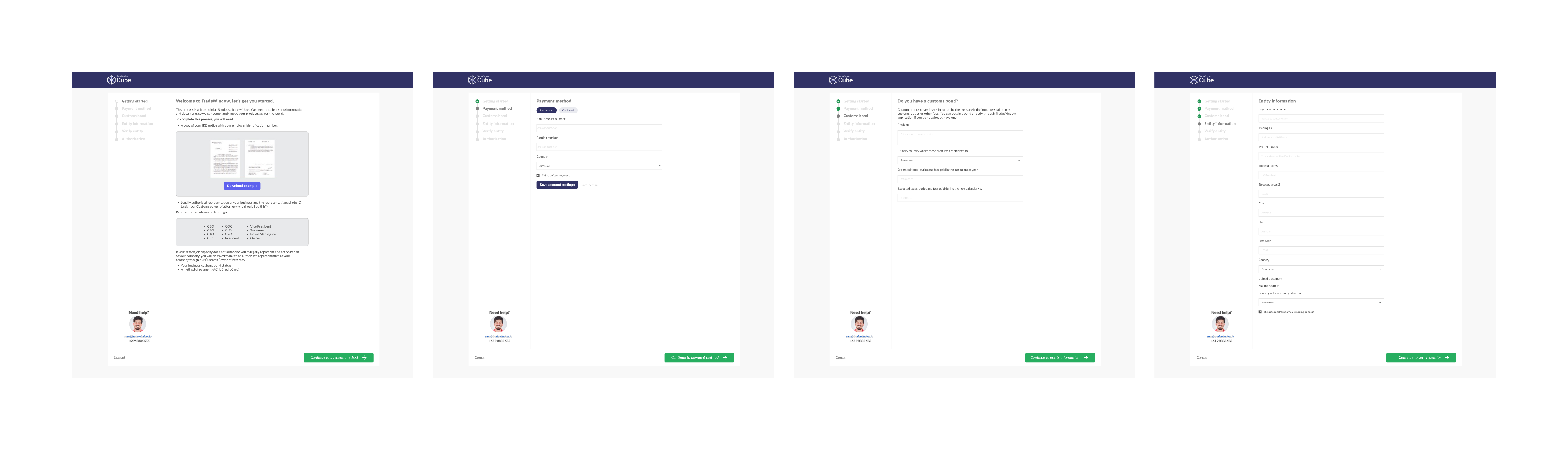
Once the workflow shape was understood, I moved into sketching and low-fidelity exploration to test structure, sequence, and interaction without locking into polished UI too early.
Starting rough made it easier to reason about flow, exceptions, and navigation before the interface became too fixed. In a product like this, that mattered. The team needed room to keep refining the underlying logic as more conditions and dependencies became visible.
From there, I translated the workflow into more structured wireframes. This is where the product started to become more tangible for product and engineering: not just as a concept, but as a sequence of usable steps with clearer guidance, clearer decisions, and stronger support for users moving through setup.
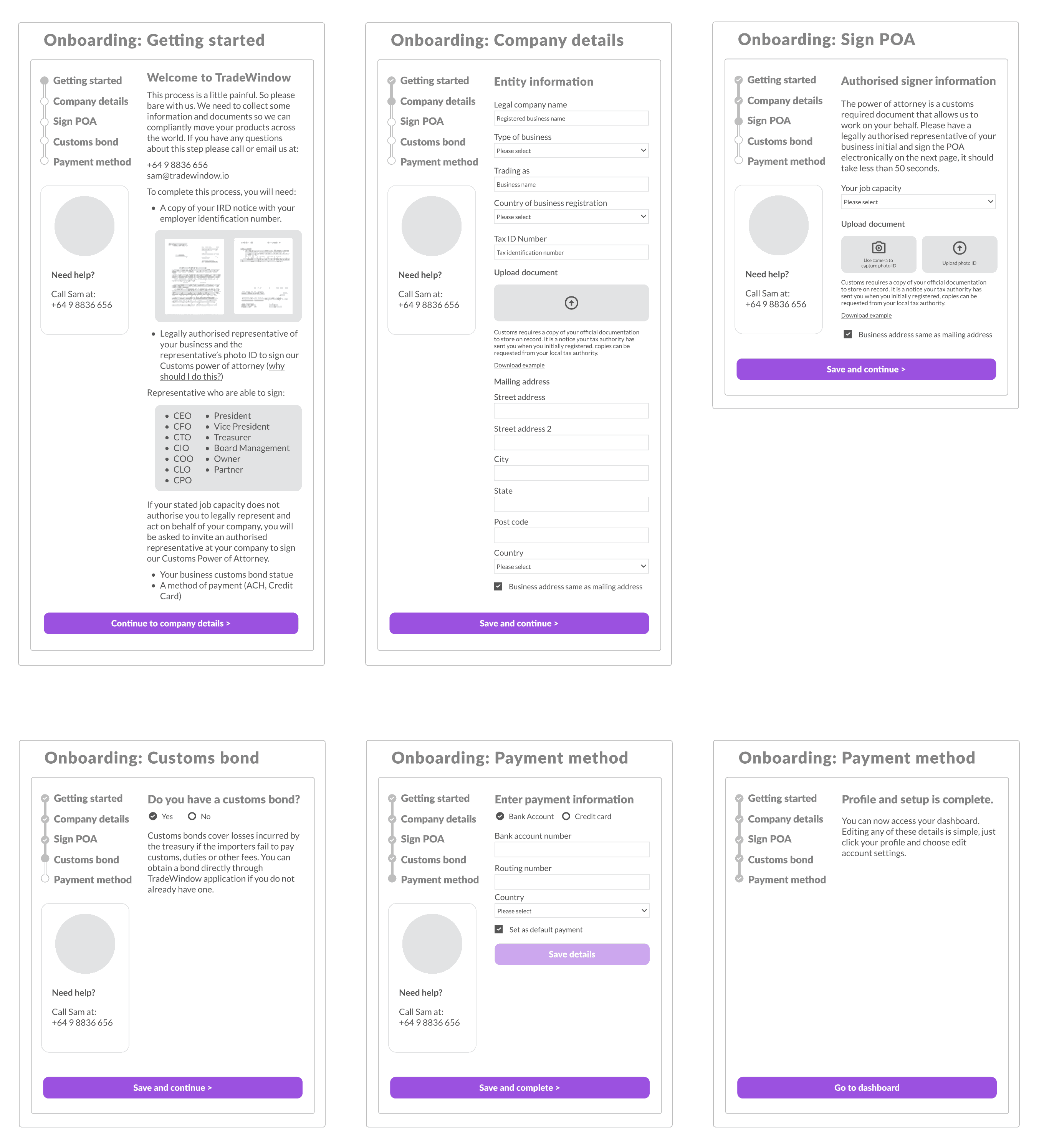
After iterating on the lower-fidelity direction, I developed prototypes and tested them with target users. This helped validate whether the flow made sense, whether the guidance was sufficient, and where the friction points still sat.
The testing surfaced more edge cases and led to further refinement, particularly around onboarding, compliance conditions, and the many ways real-world organisational setup could diverge from the ideal path.
Alongside onboarding and workflow design, a big part of the work was making the product feel like a shared operational environment rather than another disconnected tool.
The aim was not to create separate experiences for every role. That would only have recreated the fragmentation Cube was trying to reduce. Instead, the design needed a shared structure that gave different users enough visibility, context, and orientation to work effectively inside the same system.
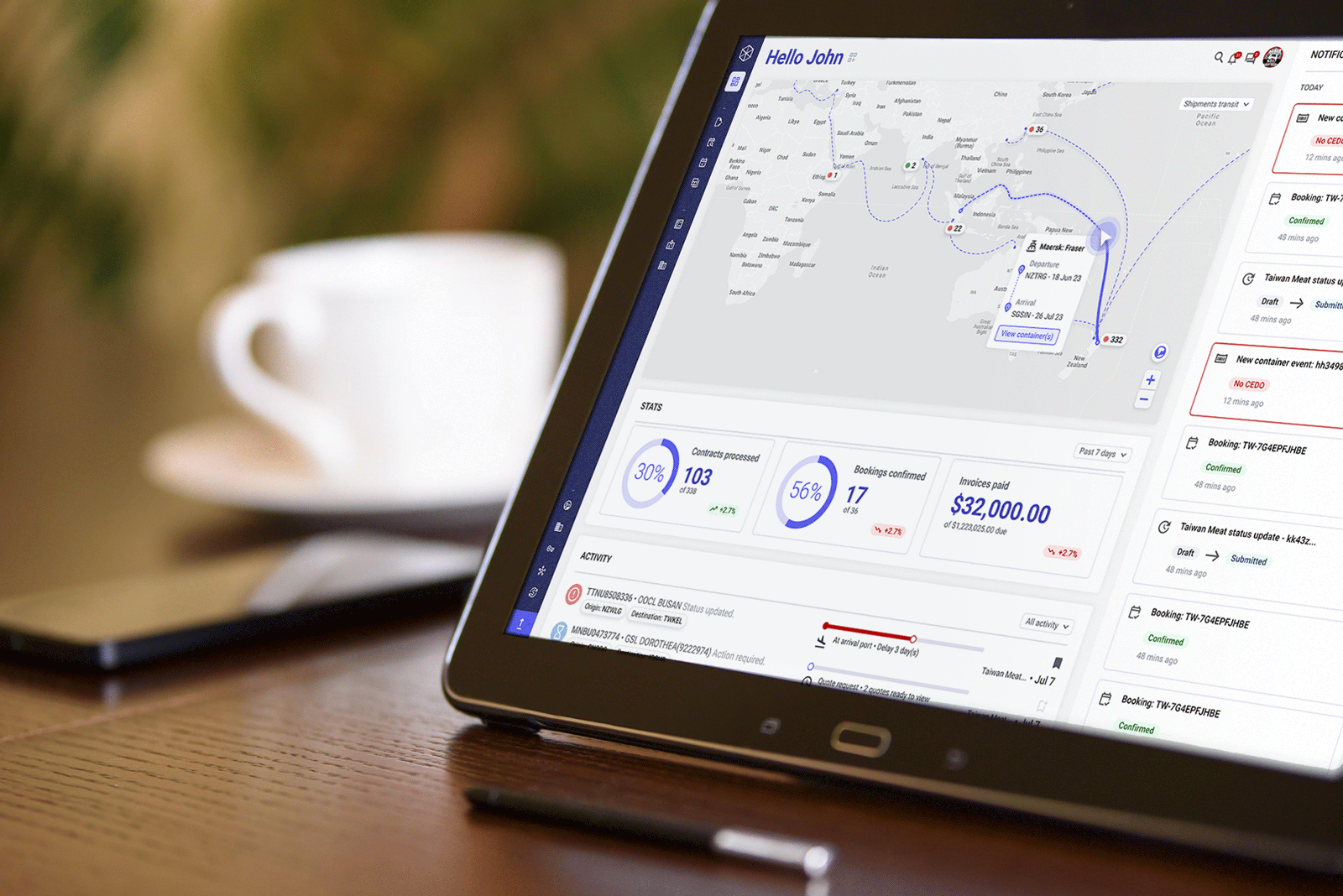
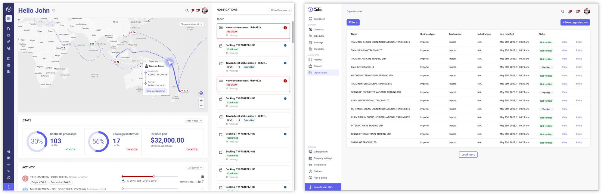
One of the key pieces was the dashboard. This was not just a summary screen. It was a way to help users understand system state more quickly across shipments, notifications, schedules, templates, bookings, and organisation setup.
That clarity mattered because users were often dealing with partial information and shared responsibility. The dashboard helped reduce the need to reconstruct what was happening from scattered sources.
Cube created a stronger foundation for managing trade processes in one place.
The design work helped shape a platform that brought together documentation, compliance, logistics, collaboration, and organisation setup into a more coherent operating model. Instead of forcing users to stitch the process together across fragmented systems and role silos, Cube moved toward a shared environment built around visibility, coordination, and action.
Time study result
Using Cube saved 1m 53s per booking
(Traditional method took an average of 3m 19s)
What I still like about this project is that it captures something I come back to often: in complex systems, the UX challenge is rarely just about making one screen simpler.
It is about understanding how people depend on each other.
Cube was valuable because it treated trade as a connected chain of specialist work rather than a flat list of isolated tasks. That changed the product architecture, the dashboard, the onboarding model, and the way the system needed to support everyday use.
The goal was never to make global trade look simple. It was to make it more navigable, more coherent, and less dependent on users carrying the full burden of process complexity in their heads - and that is the kind of work I find most meaningful.